Drawing Comics on the Go with Free Software
Want to make a comic, but can't seem to find the time? Here's a portable method that can be squeezed into spare moments -- anywhere you can bring a laptop or a sketchbook. It's the method that I use to draw Electric Puppet Theatre -- penciling in restaurants, laundromats, and grocery stores; inking and coloring on the bus to and from work. Maybe it will work for you.
The first steps (thumbnails and layouts) take place in my sketchbook. If you're interested in the software part of the process (scanning, lettering, inking, coloring, and publishing) you may want to skip ahead to the laptop portion. For additional tips and workflows, check out the references that I've drawn on.
(N.B.: Section headings are linkable in case you'd like to bookmark your place and come back later).
Part 1: Sketchbook
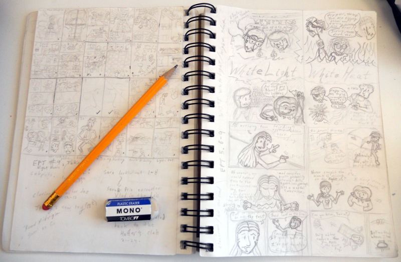
All of the initial work is done in small, easily portable sketchbooks. The main constraint on the sketchbooks is that the drawable area be as close as possible to the aspect ratio of the final page (EPT uses the "standard" comic book ratio of 2:3). My current sketchbooks are a Canson 5.5x8.5" 65lb "Universal Sketch" (pictured below) and a Pentalic 5.5x8" 70lb "Sketch Book"; both have perforated pages which makes it easy to tear out the art for scanning. Since I've switched to scanning by camera, I leave the original art in the sketchbooks to make it harder to lose. All sketching is done with #2 pencils and Tombo Mono erasers.
Thumbnails
I work top down, from the general to the specific, first choosing the story; then its break down into pages, layouts and panels within each page; and, finally, rendered drawings.
The first step, the factoring of a story into pages and panels, is usually some combination of scripting (e.g., a written "screenplay" for the comic) and thumbnailing (e.g., very zoomed out sketches of the visual flow of the comic). The balance between scripting and thumbnailing often seems to complement a writer's strengths -- I find dialog much easier to keep in my head than images, so I script EPT almost entirely in thumbnails; this forces me to think about the comic visually from an early stage and makes it easier to remember visual decisions.
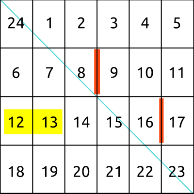
For the purpose of thumbnailing, the "standard" comic book format of 24 2:3 pages has a very convenient property: arranging the pages in a 6x4 grid gives a perfect square. This suggests an easy method for constructing a thumbnail template with the right proportions:
- Fold a piece of paper diagonally, so that the top and left edges meet. This defines a perfect square.
- Draw a line where the right edge meets the paper. This marks the bottom of the square.
- Unfold the paper and re-fold vertically so that the top edge meets the line marking the bottom of the square. Fold in half vertically again. This gives creases marking the four rows of the grid.
- Unfold the paper and re-fold in half horizontally. Fold the folded paper in thirds. This gives creases marking the six columns of the grid.
- Unfold and number the pages. The top left corner is the final page (24), and the remaining pages (1-23) follow left to right, top to bottom. This scheme ensures that two page spreads (e.g., 2/3) are always adjacent. Within the grid, it is useful to highlight pages 12/13 (the innermost two-page spread -- a good place for a big, splashy layout) and the breaks between pages 8/9 and 16/17 (the breaks between the first, second, and third portions of the comic -- useful for thinking about pacing).
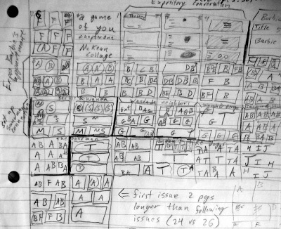
A good exercise for thinking about layout and pacing is to thumbnail an existing comic that you admire. As a warm-up for writing the first chapter of EPT, I thumbnailed chapter 1 of Neil Gaiman's A Game of You (The Sandman, volume 5), marking each character with a different letter.
I am ready to start thumbnailing when I know how a chapter will advance the plot. For example, in chapter 1 the puppets meet and form a band; in chapter 2, Vlad the vampire sneaks into the lab building and steals Sara's laptop. In the midst of all of this, there will be room for characterization and foreshadowing, but the plot point gives the skeleton on which these other details can be hung.
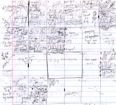
Given the plot point, I know where the chapter begins and ends, so I can choose a pair of images for the first and last page (which are adjacent in the thumbnails). I try to choose a pair of images that are visually and/or thematically complementary -- chapter 1 starts with Janice alone and ends with her new group of friends; chapter 4 starts with two raccoons looking in on Sara and ends with Sara and Pria looking in on Vlad.
Next, I make a guess at what the 12/13 spread will be and where each scene might start (using 8/9 and 16/17 as initial guesses). Given these anchors, I start filling in page layouts from page two, jumping around the chapter as different scenes occur to me. If you picture the scenes as a series of connected springs, the goal is to string them across the chapter with even tension. If a spring is stretched too thin (a scene covering many pages with not many panels per page), try adding an additional piece of business (drawing on little events from your own life is a useful trick). Where a spring is compressed, try allocating a few pages from an adjacent scene or saving some elements for a later chapter (this is a good way to avoid overly long expository dumps and keep the story moving).
Layouts
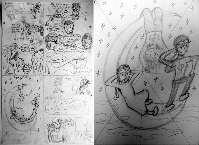
Once I have a sense for what will happen on each page, I am ready to start penciling. I start by drawing four comic pages in each notebook page (i.e., about 3x4.5 inch layouts) and draw full-page second drafts for difficult pages. Starting small serves several purposes: it makes me focus on the important visual elements of each page (rather than getting lost in the details), it gives me a sense for the complementary layout of facing pages, and it is a good match for the information content that can be shown on the web (Scott McCloud's rule of thumb is that a computer can display about half the visual information of a printed page). Surprisingly, working up to a difficult drawing through a series of smaller to larger sketches is much more efficient than starting immediately on a full sized rendering.
Will Eisner was a strong proponent of lettering a page in the early stages of layout. This plays to comics' potential for cooperativity between images and words and emphasizes the importance of lettering in the visual flow of the page -- the reader will attempt to read the words sequentially, so they should be placed along the path that you want the reader's eye to follow; the time spent on the text and intervening images should form a balanced rhythm. For this reason, I add lettering to the pencils as part of blocking in the page. If I can't cram in a particular bit of text with my smallest handwriting, it's a good clue that a few words need to go.
Pencil and paper is a remarkably versatile medium for trying out visual ideas quickly. For this reason, I try to make my pencils "tight" in the sense of resolving all important artistic decisions. The computer is a very powerful tool for rendering a clean final image, but it is much easier to concentrate on the naunces of rendering if the details of what is to be drawn have already been dealt with on paper.
Part 2: Laptop
EPT is finished on a Dell Latitude D630 with a core2duo processor (T7300 @ 2.00GHz), 2 GB RAM, and an integrated Intel graphics chip (translation: a cheap, middle-of-the road 5lb laptop -- you should be able match it for about $600-$800 circa 2012). On the rare occasions that I draw at my desk, I connect a second monitor to get simultaneous detail and full-page views. For the more common case of working on the laptop alone, I use virtual desktops to get the same effect.
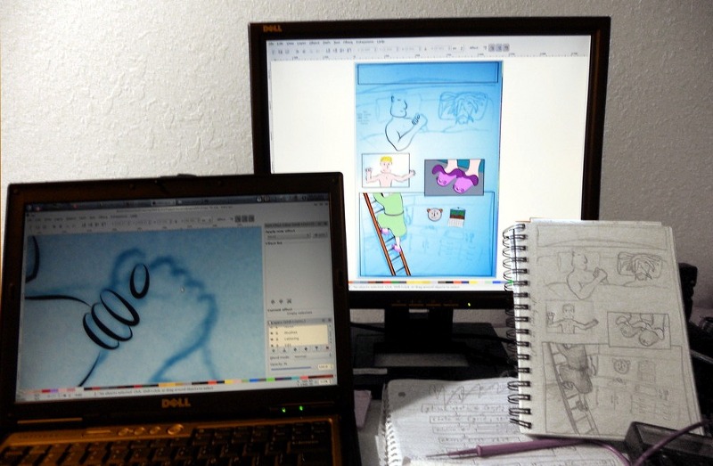
The laptop runs the Ubuntu Linux operating system with the KDE 4 desktop. You can test drive this system on your own computer by downloading a Kubuntu Live CD or USB image.
An advantage to working on Ubuntu is that all of the tools for drawing EPT can be downloaded in one fell swoop via the APT package manager:
apt-get install inkscape gimp comix gpick kcoloredit \
make pdftk ghostscript imagemagick git-core
Scanning
A common workflow is to use a flatbed scanner for digitizing penciled or inked artwork. Although this has the advantage of capturing linework with uniform intensity across the page, it has the disadvantage of being slow and requiring a relatively large and expensive piece of hardware. If you can tolerate some distortion and non-uniformity in the aquired image (e.g., because you will be doing all of the rendering on the computer), then a digital camera is a cheap and fast alternative to a scanner. I chose a Nikon Coolpix S3000 for its compatability with gphoto2's remote-capture feature, but any digital camera or camera phone should work.
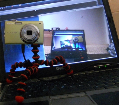
Here's how I "scan" pages with the Nikon:
- Open the sketchbook on a flat, decently-lit surface like a desk.
- Calibrate the white balance on the camera to a blank sketchbook page.
- Set the camera on "macro" mode
- Capture pages with a steady hand. Taking pictures is fast, so go ahead and take a few pictures to get a well focused, unskewed image of each page.
Having acquired the sketches, the next step is to crop each page and enhance the contrast for easy inking. For this I use The Gimp, the Swiss army knife of bitmap editors.
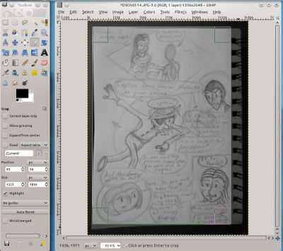
For each photo:
- Use File → Open (ctrl-o) to open the camera image (or just "gimp filename" from the command line)
- If necessary, use Image → Transform → Rotate 90° to orient the image.
- Zoom so that the image fills the window (ctrl-shift-E)
- Select the crop tool (shift-C), drag the borders of the crop box to the page edges, and press enter to crop.
- Enhance the contrast with Colors → Auto → White Balance
- Flatten to black and white with Image → Mode → Grayscale
- Save the edited image (ctrl-shift-S)
- If the photo contains multiple pages (e.g., from a 4-to-a-page layout), use undo (ctrl-z) to back up and crop the next page.
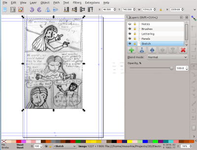
The next step is to import the scanned page into Inkscape for rendering:
- In Inkscape, use File → Open (ctrl-o) to open Template.svg. This is a single page template with the stock layers and brushes that I use for every page. It has the desired 2:3 aspect ratio and guidelines for margin and trim areas for Ka-Blam's print-on-demand service. Since we'll be working with vector images, the absolute resolution of the template only matters for font sizes and line widths -- 2100x3150 is a reasonable choice.
- Save under a new name (ctrl-shift-S) to avoid overwriting the template file. Naming files by chapter and page (e.g., 001/Page-01.svg) is a good way to keep things organized and makes it easy to do batch post-processing.
- Select the "sketch" layer from the layers menu (ctrl-shift-L) and make sure it is unlocked
- Orient the view on the full page (5)
- Use insert image (ctrl-i) to insert the sketch for this page (choose "link" rather than "embed" to keep the SVG file small).
- Move and scale the sketch to fit it to the page. When scaling, hold ctrl to preserve aspect ratio and/or shift to scale around the center of the sketch. If the fit is a bit off, you can scale without holding ctrl to stretch in one dimension or click once on the sketch to get rotation handles for fixing the orientation.
- With the sketch selected, use Filters → Colors → Duotone to apply "blue pencil" coloring to the sketch (this helps distinguish pencils from inks later on).
- Lock the sketch layer.
Finally, I add the page to my git version-control repository so that I can easily back-up and track my changes:
- Initialize the repository (only necessary for the first page)
git init
- Add the new page to the repository
git add 001/Page-01.svg && git commit -m 'Adding chapter 1, page 1'
- Save current edits (after saving from Inkscape)
git commit -am 'Started inking page 1'
Cory Doctorow has a good description of git here, and there are some animations of the EPT git repository here.
Lettering
Video links: Download
With the page prepared, the first step is to fill in the lettering using EPT Kazoo, a font that I created with FontForge to match my inking style:
- Unlock the lettering layer.
- Switch to the text tool (f8) and choose a font and point size from the tools control bar (or ctrl-shift-t for the text and font dialog). Settings that you change before typing will become the new defaults.
- Use the text tools control bar to adjust the spacing between
lines and alt-arrowkeys to fine-tune the kerning between letters
(if you have to do this a lot, switch to a better kerned font).

- Switch to the select tool (f1) to position the text.
- Use the circle tool (f5) to add word balloons. Set fill/stroke color and stroke width by right-clicking the boxes in the lower left corner of the status bar (or ctrl-shift-f for the fill and stroke dialog).
- Switch to the select tool (f1) and use page-down to put the word balloons underneath the lettering.
- Convert the balloons from circles to paths (ctrl-shift-c), and use the node tool (f2) to squash them into more rectangular shapes.
- Add tails:
- Select a balloon and copy it (ctrl-c)
- Draw a triangle with the pen tool (shift-f6)
- Paste the balloon style (ctrl-shift-v)
- Select both the balloon and triangle and union them (ctrl+plus)
- Use the node tool to refine the tail
Inking
I ink Electric Puppet Theatre using Bezier curves -- smooth parametric paths originally invented to describe the space-age curves of 60's-era cars. For this part of the workflow, I need to move rapidly between the brush layer and various inking layers without mixing them up. It's also useful at this stage to work at multiple levels of zoom. A good way to deal with both of these problems, particularly on a laptop with a single 14" screen, is to use virtual desktops:
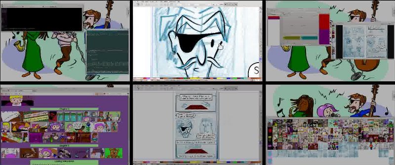
I split my workspace across six virtual desktops using the system settings in KDE4. Most X11 environments (e.g., Gnome, Xfce, etc.) have a similar feature, and you can get a similar effect using "spaces" on OS X or a third-party tool on Windows. I bind ctrl-alt-arrowkeys for easy desktop switching and set window behavior to "focus follows mouse" for quick switching between windows. In Inkscape, create a second window with View → Duplicate Window.
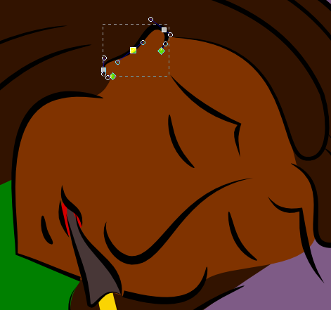
Bezier curves are defined by a series of nodes (points that the curve passes through) and handles (points that cause the curve to deviate from a straight line). You can think of a node and its handle as an arrow specifying the direction of the curve as it exits the node. The longer the arrow, the longer the curve will follow that direction before turning to match the direction specified by the next node and handle. A pair of adjacent nodes with small arrows will be joined by a gentle, slowly changing curve, while a pair with large arrows will be joined by a sharp zig-zag. In general, for an open curve, you will want one more node than the curve has inflection points. Adding additional nodes will give you more control at the expense of giving the curve a flattened appearance.
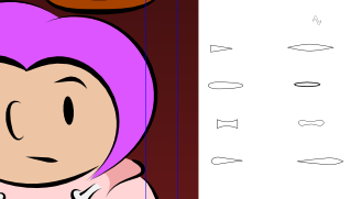
Normally, the path described by a Bezier curve is rendered at a fixed width, making it look as if it were inked with a Micron or Rapidograph. We can get a more brush-like effect by using Inkscape's "Pattern along Path" effect to stretch a closed curve (the "brush") along the path. You can use the brushes from my template SVG (they're in the "brushes" layer, to the right of the page) or you can define your own by drawing closed curves with the pen tool.
Here's how to draw brush-like curves:
- In the "zoomed" window, unlock the layer that you want to
ink, choose the pen tool (shift-f6), and check that the pen
shape is set to "from clipboard"

- In the "full page" window. choose the select tool (f1), select a brush from the brushes layer, and copy it to the clipboard (ctrl-c)
- Switch back to the "zoomed" window (note that the pen tool and inking layer will still be selected)
- Use the left mouse button to place the nodes of your curve. Press enter when you are done (or, for a closed curve, click the first node).
- Adjust the brush width in the Path Effect Editor (ctrl-shift-f7).
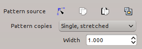
- Zoom in on the selection (3) and switch to the node tool (f2).
- Click and drag on the line segments between your nodes to pull them onto your penciled curves.
- Refine the curve by clicking and dragging the circles for the
nodes and handles. Use the tool control bar to switch between
"smooth" and "cusp" nodes.

Coloring
Video links: Download
As a final step, you may choose to color, tone, or add spot blacks to the page (alternatively, you can use techniques like cross hatching or feathering as part of your inking step). There are a few ways to lay in these "flats", depending on your linework:
- Filling with the paint tool:
- Hide the sketch layer (complicated backgrounds confuse this tool)
- Choose the paint tool (shift-f7)
- Choose appropriate "grow/shrink" and "close gaps" parameters for your linework from the tools control bar -- 2px and large are good starting choices. The grow parameter should be large enough to extend the fill slightly into your linework (so that it appears flush). The gap parameter should be permissive enough to detect the area that you want to fill without subdividing it.
- Click on the area you want to fill -- a new path will be created filling the area
- Choose a new fill color
- If necessary, use the node tool (f2) to ajust the borders of the fill.
- Move the filled path to the bottom (end).
- Duplicating a path:
- Select a stroked path
- Duplicate it (ctrl-d)
- Remove the path effect (X in the path effects dialog) -- this will make the duplicated path a solid black fill.
- Choose a new fill color
- Move the filled path to the bottom (end).
- Drawing the fill path directly with the pen tool
- Choose the pen tool (shift-f6) and set shape:none.
- Draw a closed path following your linework, as in the inking step.
- Choose a fill color and remove the stroke.
- Move the filled path to the bottom (end).
Whichever technique you use, remember to work front to back -- this makes it easy to place each new fill with "end" and avoids putting work into background details that will wind up hidden.
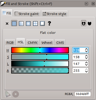
To edit colors, use the Fill → HSL tab in the Fill and Stroke dialog (ctrl-shift-f). You can also paste rgb hex codes directly into the RGBA box, which is a good way to copy colors from palette editors such as gpick or kcoloredit. You can also use these editors to create a custom palette with named colors -- just save the palette in gimp/inkscape GPL format and copy the file to your Inkscape configuration folder (e.g., the EPT palette lives in ~/.config/inkscape/palettes/ept.gpl)
Publishing
Webcomics
If you want to put your comics on the web, you'll need to find a server for them to live on. Here are some options:
- Free Hosting ($0)
- There are several sites that will host your comic for free in exchange for decorating your page with their own ads and branding. The original version of this article suggested Webcomics Nation, which is no longer around, and Smack Jeeves, which is having problems of its own. Comic Fury may be a reasonable choice.
- Shared Hosting (~$3/month)
- Services like Dreamhost will let you upload a limited range of content (e.g., web pages built with HTML, JavaScript, and PHP) to a web server shared by multiple users. Most hosts provide easy-to-use control panels for installing popular PHP frameworks like Wordpress, making them a good fit for comic hosting. DJ Coffman has a good tutorial for setting up a webcomic on Dreamhost using the Comicpress theme for Wordpress.
- Virtual Private Server Hosting (~$5/month)
- If you're comfortable administering your own LAMP stack, a VPS host like Linode offers the most control. This type of host provides a complete virtual Linux server which shares physical hardware with virtual servers belonging to other users. Frameworks like Wordpress are still easy to install (e.g., using Debian's APT package manager or from the latest source) or you can build your site from scratch in your favorite language.
For the second two options, you'll also want to register a domain name and point it at your host. I like Gandi ($15/year), but there are many cheaper options.
Finally, you'll want to render your comics in a web-friendly format. While several web browsers (e.g., Firefox and Chrome) can handle Inkscape's native SVG format, feature support is uneven; for the moment, you'll get more consistent results by serving PNG bitmaps at a reasonable resolution. Vertically oriented "full page" web comics tend to be 500 to 1000 pixels across, while horizontal "strips" are a bit wider; you should choose a resolution high enough to make your lettering legible, but low enough to preserve the visual flow of the page. I render at 600x900 for EPT's single page mode which is then scaled to screen height for double page mode (note that this scaling is unreliable on iPads, which have an interesting interpretation of screen height, and older web browsers, which have poor resampling algorithms).
You can generate your PNGs from inside Inkscape via File → Export Bitmap... (ctrl-shift-e), or from the command line like so:
inkscape Page-01.svg --export-png=Page-01.png -w600 -h900 -C -bffffff -y1.0
E-books
If you want people to be able to read your comic off-line, you'll need a file format that supports multiple pages (unless you decide to pack everything into one big image). There are lots of choices, of which PDF and CBZ are the most portable.
A CBZ file is simply a ZIP archive of your page PNGs. On the one hand, CBZs are easy to generate and look exactly the same on every platform; on the other hand, they are limited to a fixed resolution and are somewhat obscure.
To generate a CBZ, simply zip up your pages with the proper file extension:
zip Comic.cbz Page-*.png
To make things even easier, you can automate the rendering and archiving process with a build tool like GNU Make. Here's a sample Makefile for compiling a 24 page comic.
Unlike CBZ, the PDF format is ubiquitous. As a vector format, PDF has the advantage that it can pack your art into a smaller file size with higher (effectively, infinite) resolution. The disadvantage is that vector PDFs will render differently on different devices, and certain SVG effects (e.g. filters and transparency) are difficult to represent in PDF.
You can generate a single-page pdf like this:
inkscape --export-pdf Page-01.svg Page-01.pdf
To concatenate multiple pages into a single document, use a utility like pdftk:
pdftk Page-*.pdf cat output Comic.pdf
The steps above tend to generate very large PDF files. This can be remedied with a final clean-up step via ghostscript's pstopdf utility:
pstopdf Comic.pdf BetterComic.pdf
Here is a sample python script for automating the process.
Print on Demand
If you'd like to sell physical copies of your comic but don't want to pay for printing up front or clutter your home with boxes of unsold comics, you may want to consider print-on-demand (POD). The Webcomics Alliance has a good comparison of the "big three" services. I chose Ka-Blam for their simple TIFF submission format. Because Ka-Blam submissions are raster images (rather than PDF), the rendering process is very similar to rendering for the web, just at a higher resolution (300 dpi) and with some post-processing in ImageMagick to handle page borders and TIFF formatting.
Here's how to render a typical white-bordered page for Ka-Blam:
inkscape Page-02.svg --export-png=Page-02.png -w1900 -h2850 -C -bffffff -y1.0
convert -size 2100x3150 xc:white -fill white -page +100+150 Page-02.png -flatten \
        -compress lzw Page-02.tif
And here's the equivalent step for a "full bleed"
inkscape Page-01.svg --export-png=Page-01.png -w2100 -h3150 -C -bffffff -y1.0
convert Page-01.png -flatten -compress lzw Page-01.tif
ImageMagick is also useful for checking your rendered pages against the "trim" region in Ka-Blam's page template:
composite -blend 50 Page-01.tif 2010_comic_template.png Proof-01.png
You can see how my test print turned out here.
Minicomics
Of course, the simplest way to distribute your comic is to just print it yourself. Here is an excellent introduction to the DIY approach from Jessica Abel of La Perdida and Life Sucks.
The End
Wow, you made it this far? Congratulations for reading the whole article. If you have any questions or comments, please send them to markv [at] eptcomic.com. Now grab a pencil and get comicking!
(Or, if you'd like to procrastinate, see below for some excellent tools and tutorials...)
References and Further Reading
- Complete comics workflows
-
Prentice Rollins: The Making of a Graphic Novel
Complete workflow for making a graphic novel with excellent
and specific advice on each step. But wait, there's more!
Flip the book over and it's a complete sci-fi graphic novel.
What a bargain!
Dirk Tiede: Process Tutorial
script/reference/thumbnails/layouts/pencils/inks/photoshop/illustrator
workflow for the manga-style werewolf detective comic
Paradigm Shift.
Aaron Diaz: How a Dresden Codak Page is Made
A mostly digital concept/thumbnail/pencil/paint/flat/render
workflow for infinite canvas webcomics. (See also his great series of
theory posts)
Sophie Goldstein: Process Post
(Part 1,
Part 2)
pencil/ink/photoshop workflow for the webcomic
Darwin Carmichael is Going to Hell.
See the second post for an interesting texture effect.
Les McClaine: Penciling and Inking
thumbnails/pencils/inks workflow for a ligne claire style
comic.
Angela Melick: Writing Comics (video)
Very thorough presentation on writing comics by
Angela Melick (of Wasted Talent). See also this process time-lapse video.
Aaron Renier: Adventure Time!
roughs/line art/colors workflow for a page of Adventure Time!
Liz Staley: Evolution of a Comic Page
Digital workflow for a page of the mecha comic
Adrastus.
Griatch: Comic Making using MyPaint, Gimp, and Inkscape
Very complete free software workflow from script to comic page.
Miricham: Now in Hot Post Format
A complete digital workflow for Riverside Extras
Michael Jantze: The Norm Tutorial
Penciling/lettering/inking/digitizing workflow for
The Norm
Lynn Johnston: The Making of a Comic Strip
Writing/drawing/inking/toning workflow for
For Better or Worse.
Dave Kellett: How the comic strip "Sheldon" is Created
Time lapse video of Dave Kellett drawing Sheldon.
Jim Zub: Rambling about how I write comics
On
brainstorming,
story pacing,
page planning,
scripting, and
dialog for
Skullkickers.
- More general advice on making comics
-
Scott McCloud:
Understanding Comics, Reinventing Comics, Making Comics
Broad surveys of comics' history and potential, packed
with interesting and useful ideas. In terms of practical
advice, chapter two of Making Comics (Character Design,
Facial Expression, and Body Language) is the most useful;
the end-of-chapter exercises in Making Comics may also
be useful triggers for getting started.
Will Eisner: Comics and Sequential Art
The spiritual precursor to the McCloud books.
Allen Moore: Writing for Comics
More of a rant than specific advice, but still a useful manifesto
for pushing yourself creatively.
- Faces and body language
-
Gary Faigin: The Artist's Complete Guide to Facial Expressions
Insanely good guide to drawing heads, features, and expressions
(this is the basis for chapter 2.2 in Making Comics).
Indispensable.
Tracy Butler: Notes On Expression! (of the face-type kind)
Beautiful poster of comic-expression do's and don'ts from
the creator of Lackadaisy.
Mark Bernier: Cartoon Anatomy
A thorough set of useful guidelines for drawing something
between "stick figures [and] totally realistic anatomy" from
Mark Bernier of the Comic Tools blog. Incredibly
useful. Blogger lists the anatomy posts in reverse chronological
order, so you might want to start
here.
- Layouts and Composition
-
Rivkah: Paneling, Pacing, and Layout in Comics and Manga
(Part 1,
Part 2)
Part 1 gives some interesting rhythmic ideas for placing and
grouping panels. Part 2 discusses visual flow through the page.
Chris Schweizer: The Schweizer Guide to Spotting Tangents
Interesting discussion of lines that don't do what you intended.
Carson Van Osten: Disney Comic Strip Artist's Kit
Great layout guide from Disney artist Carson Van Osten.
Wally Wood: 22 Panels that Always Work
"or some interesting ways to get some variety into those boring
panels where some dumb writer has a bunch of lame characters
sitting around and talking for page after page".
Thanks to Joel Johnson for buying the original art and posting
it on the web. For a light-hearted webcomics variant,
see Joseph Hewitt's 22 Fast Panels that are Always on Time.
- Rendering
-
Sean Michael Robinson: The Craft Behind Cerebus
Excellent three-part interview with Cerebus' Gerhard. Features
deep discussion of inking and good reference books. N.B.: The
TCJ site that hosts the interview is a bit flakey, so you may
need to use Google's cache.
Steve Bissette: Sketch Instructionals
Penciling and inking tutorial from Swamp Thing's Steve Bissette.
Sandy Debreuil: Using Flash to Ink your Web Comic
The Flash-based workflow for Crowbar Benson.
Dan Shive: Behind the scenes! (What? Nerds asked me!)
Using Google Sketchup for proportion and perspective guides
for a page of El Goonish Shive
- Coloring
-
James Gurney: Gurney Journey
Very useful blog covering color theory, composition,
and art history, from the creator of
Dinotopia
Alexandre Prokoudine: Creating Color Schemes with Gpick
In-depth tour of the gpick palette editor
Melanie Gillman: 5 Easy Ways to Improve Your Coloring
Cute and useful coloring handout.
Liz Stanley: Comic Book Coloring with Liz
A Manga Studio coloring tutorial from
Liz Stanley of Adrastus
- Lettering
(See also this list of fonts used to letter EPT)
-
Todd Klein: Lettering How-To's
Tutorials from the letterer's letterer.
Nate Peikos: BlamBot
Excellent resource for comic lettering fonts. See also Nate's articles on: Designing a font for Elfquest,
Comic book grammar
and Script formatting.
Matt Bernier: Balloon Shape
Great post on negative space and word balloons.
Scott McCloud: Lettering and Panel Borders in Illustrator
A cool (but Illustrator-specific) technique for fast
word balloons.
Richard Querin: Comic Bubbles
Screencast video on making word balloons in Inkscape.
Richard and pal heathenx have a whole archive of useful
Inkscape tutorials at
screencasters.heathenx.org
Jamie Noguchi: Lettering Resources
A nice list of articles and related lettering resources.
- Web Publishing
-
DJ Coffman: How to Host Your Own Webcomic
Clearly written tutorial based on ComicsPress and Dreamhost --
probably the most common route for webcomics that don't use
free hosting.
Rachel Nabors: Redesigning Webcomics
Useful advice on site design for a webcomic
(more here)
- Cool web tricks
-
Mike Leung: Stream Comics in Any Direction with Common-Sense Scrolling
Interesting CSS/Javascript trick to link scrolled text to
displayed comic panels.
Stevan Zivadinovic: Building a Parallax Scrolling Storytelling Framework
A breakdown of the sweet CSS/Javascript tech behind
Hobo Lobo of Hamlin.
Colophon
Videos were captured and post-processed with FFmpeg.
Capturing a 1280x720 screencast from a 1366x768 X11 display at 24 fps:
ffmpeg -f x11grab -s 1280x720 -r 24 -sameq -i :0.0+0,48 screencast.mpg
Trimming to the segment from 2.75 seconds to 110.29 seconds and transcoding to webm (takes about 4 minutes per minute of video):
ffmpeg -i screencast.mpg -ss 2.75 -t 107.54 -sameq -vcodec libvpx screencast.webm